 Aleo April 17, 2025
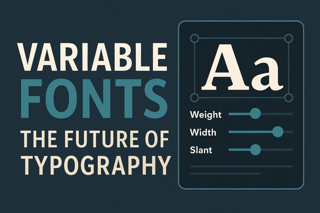
Variable fonts represent a significant advancement in digital typography, offering designers and developers enhanced flexibility, efficiency, and creative control. By consolidating multiple font styles into a single file, they streamline web performance and open new avenues for responsive and dynamic design.
What Are Variable Fonts?
Variable fonts are an evolution of the OpenType font format, introduced in version 1.8 of the OpenType specification in 2016. Developed collaboratively by major tech companies—Apple, Google, Microsoft, and Adobe—they allow a single font file to contain multiple styles and weights, which previously required separate files. This innovation builds upon earlier technologies like Apple’s TrueType GX and Adobe’s Multiple Master fonts, which laid the groundwork for today’s variable fonts.
Key Features of Variable Fonts
1. Design Axes
Variable fonts operate along one or more axes, each representing a typographic property that can vary continuously. The five standardized axes are:
- Weight (
wght): Controls the thickness of characters, ranging typically from 100 (thin) to 900 (bold). - Width (
wdth): Adjusts the horizontal expansion, allowing for condensed or extended text. - Slant (
slnt): Tilts characters to create an oblique effect, measured in degrees. - Italic (
ital): Switches between upright and italic styles. - Optical Size (
opsz): Optimizes character details for different display sizes, enhancing readability.
In addition to these, designers can define custom axes to introduce unique stylistic variations.
2. Efficiency and Performance
By encapsulating multiple styles within a single file, variable fonts reduce the need for multiple font files, leading to:
- Smaller File Sizes: A variable font can be significantly smaller than the combined size of individual font files it replaces.
- Faster Load Times: Fewer HTTP requests and reduced data transfer enhance website performance, particularly beneficial for users with limited bandwidth.
3. Responsive Typography
Variable fonts enable seamless adaptation to different screen sizes and resolutions. For instance, text can automatically adjust its weight or width to maintain legibility across devices, from smartphones to large monitors.
Implementing Variable Fonts in CSS
To utilize variable fonts on the web, you can define them using the @font-face rule and apply variations with CSS properties:
cssCopyEdit@font-face {
  font-family: 'ExampleVariableFont';
  src: url('ExampleVariableFont.woff2') format('woff2-variations');
  font-weight: 100 900;
  font-stretch: 75% 125%;
  font-style: normal;
}
Then, apply the font and its variations:
cssCopyEditbody {
  font-family: 'ExampleVariableFont', sans-serif;
  font-weight: 400;
  font-stretch: 100%;
}
For more granular control or to utilize custom axes, the font-variation-settings property allows direct manipulation:
cssCopyEditp {
  font-family: 'ExampleVariableFont', sans-serif;
  font-variation-settings: 'wght' 700, 'wdth' 85;
}
This approach provides precise control over the font’s appearance, enabling dynamic and responsive design adjustments.
Practical Applications
1. Web Design
Variable fonts enhance user experience by allowing text to adapt fluidly to different screen sizes and orientations. Designers can create responsive typography that maintains readability and aesthetic appeal across devices.
2. Branding
Brands can maintain consistency across various platforms by using variable fonts to adjust typographic elements without altering the core design. This flexibility ensures that branding remains cohesive while accommodating different media requirements.
3. Accessibility
Adjusting font properties like weight and width can improve readability for users with visual impairments. Variable fonts allow for these adjustments without compromising design integrity.
Browser Support
Variable fonts are supported in all major modern browsers, including:
- Google Chrome
- Mozilla Firefox
- Microsoft Edge
- Apple Safari
This widespread support ensures that variable fonts can be used confidently in contemporary web development.
Conclusion
Variable fonts represent a transformative advancement in digital typography, offering a combination of design flexibility, performance optimization, and responsive adaptability. By embracing this technology, designers and developers can create more dynamic, accessible, and efficient digital experiences.