For over three decades, the World Wide Web Consortium (W3C) has been the silent architect behind the internet we use every day. From HTML to CSS to accessibility standards, W3C has been setting the rules that ensure the web remains open, interoperable, and accessible.
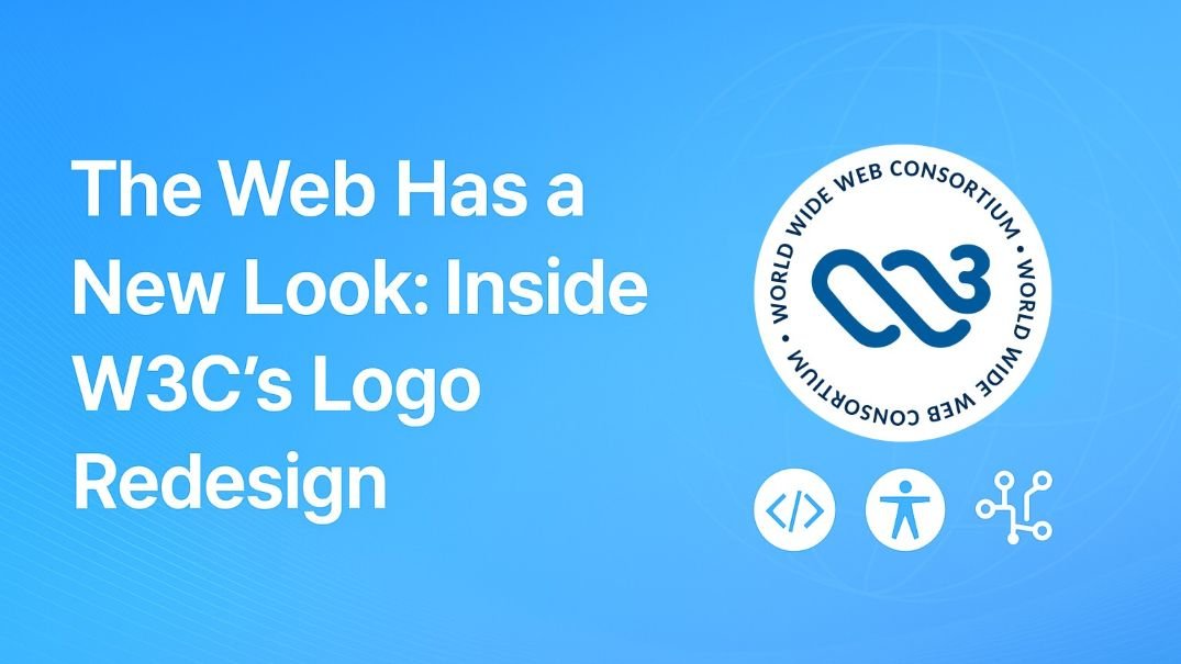
Now, W3C is doing something unusual: it’s rebranding itself with a bold, evocative new logo.
Why a Logo Matters for W3C
Logos aren’t just visual symbols, they’re identity statements. For an organization like W3C, whose work is mostly invisible to everyday internet users, a logo becomes a way to communicate relevance, trust, and vision.
The old W3C logo, simple and functional, represented stability. The new one? It’s dynamic, modern, and more expressive. It signals that the web is not static, it’s constantly evolving.
The Meaning Behind the Design
According to W3C, the new logo isn’t just a cosmetic refresh. It’s built to reflect:
- Openness: The core philosophy that web standards should be transparent and accessible to all.
- Innovation: Highlighting W3C’s role in shaping future-facing technologies like Web3, accessibility, and immersive media.
- Inclusivity: The design was tested with global communities, aligning with W3C’s mission to serve a diverse web ecosystem.
The logo design is deliberately evocative, meant to spark curiosity and represent the living nature of the web.
Why This Matters Now
In today’s internet landscape, dominated by big tech, open standards play a critical role in keeping the web free and fair. By refreshing its identity, W3C is reminding the world that it’s not just a background player, it’s still the backbone of web governance.
A new logo won’t change the standards directly, but it does change perception. For developers, designers, and tech companies, this is a signal: W3C is modernizing, and so should you.
The Bigger Picture
The redesign isn’t only about aesthetics. It’s about reasserting W3C’s presence in the next chapter of the web. As we move into an era shaped by AI, immersive experiences, and decentralized ecosystems, W3C wants to be seen not as a relic of the early web, but as its ongoing steward.
Conclusion
Logos may seem small in the grand scheme of technology, but they carry weight. W3C’s new design is more than branding; it’s a declaration that the web’s guardians are ready for the future.
References
- W3C Official Announcement
- Search Engine Journal Coverage
- Design industry analysis on brand evolutions in tech

